Printable kit, free
The printable kit.
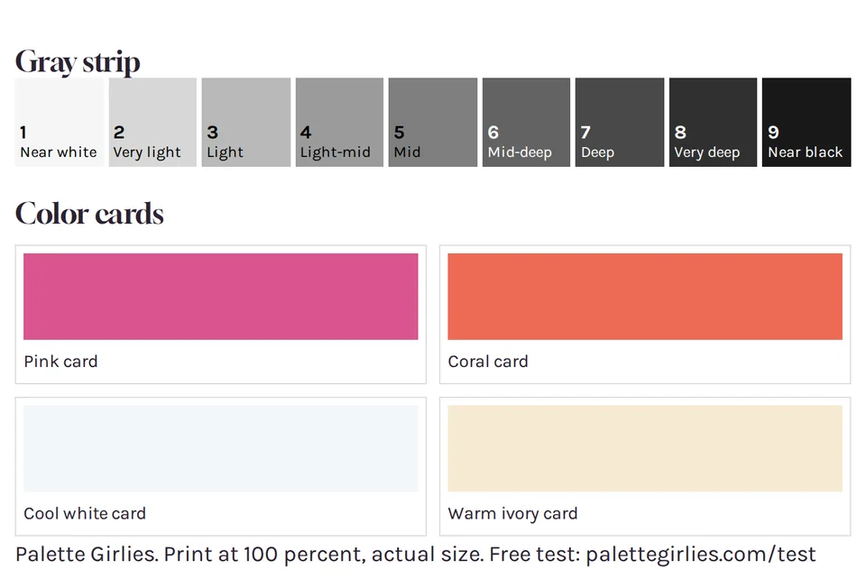
A gray strip and four color cards on one page, for the free test or for a check by a window. No email and no photo.
Print at 100 percent on matte white paper.
01 On the sheet
What is on the sheet.
One page, made to print. Strip in gray, cards in color.
The gray strip
Nine grays, from near white to near black. Held beside your face, it reads your depth and how far your features sit from your skin.
Pink and coral
A blue-based pink and an orange-based coral. One of the two tends to look calmer against your skin.
Cool white and warm ivory
Two whites. The one that matches your temperature fades next to your skin, and the other one stands apart.
A line of type
The print setting and the address of the free test, so the page still makes sense on the fridge.
02 Before you print
Three rules for a good print.
Home printers shift grays a little. These three keep the steps apart.
Print at 100 percent.
Actual size, on matte white paper, not fit to page. Each step is made to be about 25 by 40 mm, big enough to hold beside your cheek or a lip. Glossy paper adds glare, and glare changes how a gray reads.
Strip in gray, cards in color.
Print the page twice: the strip in black ink only or in grayscale, the cards in color. Color printing can mix colored inks into the grays and tint them, and the steps only work if they stay neutral.
Hold it by a window.
Hold one card of a pair at your jaw, then the other. Pink goes against coral, cool white against warm ivory. Pick the one that looks less off against your skin.
More on printing, and on a screen
Ink saver off. Print at standard or high quality. Ink saver prints lighter, and the lightest steps can merge into their neighbors.
Check the print. You should be able to tell each step from its neighbors. If steps 1 and 2, or steps 8 and 9, look the same, raise the print quality or use the strip on screen. The test only needs you to tell neighbors apart, because you compare your face with the strip and not with a number.
Step 1 can look like the paper. It is a very light gray on purpose, so the white of the paper and the black of a printer sit outside the scale. This is my design choice, and the strip has not been validated yet.
On a screen. Set the brightness to about 70 percent or more. Turn off night mode, dark mode and automatic color adjustment. Tilt the screen to avoid glare and hold it next to your face, facing the same way you are. A screen gives off light while your face reflects it, which puts two light sources in the comparison. That is why I recommend the printed strip.
Tradition Printing advice is practice, not a studied rule. Strong for how lightness reads.
03 The sheet
The sheet.
The strip and the cards sit on a white frame, because a cream background changes how grays look.
Gray strip
- 1Near white
- 2Very light
- 3Light
- 4Light-mid
- 5Mid
- 6Mid-deep
- 7Deep
- 8Very deep
- 9Near black
Color cards
- Pink card
- Coral card
- Cool white card
- Warm ivory card
Palette Girlies. Print at 100 percent, actual size. Free test: palettegirlies.com/test
04 Questions
Questions
Do I need a color printer?
The cards need color, the strip does not. Print the strip in grayscale and the cards in color, on a second copy of the page.
What does the strip tell me?
Your depth and your contrast. Hold it beside your face by a window and compare the step that sits closest to your skin.
Is it accurate?
A home check can't control your light, printer or screen. The strip is my own tool, and this system has not been validated yet.
Does it work on a screen?
Print works better: a screen gives off light while your face reflects it. If you use one, raise the brightness and turn off night mode.
05 Next step
Ready with your strip?
Take the free test next: about six minutes, no photo and no email.